5.2 Income inequality in different countries
To understand the differences in income inequality across countries, we need to know what determines a person’s income and what causes the inequalities among people’s incomes.
- tax, taxation
- A tax is a compulsory payment to the government levied, for example, on workers’ incomes (income taxes) or firms’ profits (profit taxes) or included in the price paid for goods and services (value added or sales taxes).
- redistribution policy
- Taxes, monetary, and in-kind transfers of the government that result in a distribution of final (disposable) income that differs from the distribution of market income.
A person’s income depends on several factors:
- Institutions: People living in different countries are exposed to different laws and social norms that govern how they interact as employers or workers, lenders or borrowers, buyers or sellers.
- Policies: Governments in different countries adopt different taxation, redistribution, education, and other policies that affect people’s incomes.
- Endowments: People in different countries may have different knowledge, skills, or personal attributes, or they may be able to attain different levels of education. In addition, people may have different capacities as a consequence of health or illness; they may have different levels of financial wealth from savings or investments; and their race, gender, age, or other personal characteristics may affect their employment or wages.
- Technologies: People have access to different technologies that affect their income and that may result in inequality.
Everyday Economics 5.1
Think about the role that citizenship and national birth (as an “endowment”) play in economic opportunity. If you or someone you know were born in a country with fewer economic opportunities, how would that affect your education, income, or life chances? What aspects of your economic situation do you think are due to the country or family you were born into, and what aspects are within your control? Explain and refer back to Figures 5.1 and 3.1.
The income value of a particular endowment, such as a programming skill or ownership of a 3D printer, likewise depends on technology, institutions, policies, and other factors determined by markets. For example, being physically strong was a valuable endowment in agriculture—until mechanization made it less important in determining earnings. This change in technology meant that physical skills became less valuable relative to other skills. The value of land depends on how productive it is in growing marketable crops (technology) and whether it is zoned for commercial or residential uses (institutions).
Market income and disposable income
- market income
- All the earnings a person receives from employment (wages or salaries), self-employment, savings, and investments.
- disposable income
- Start with market income and subtract any taxes a person pays. Then add any cash transfers a person receives from the government. The result is the person’s disposable income.
To assess income inequality within a country, we look at market income and disposable income. Market income is all the earnings a person receives from employment, self-employment, savings, and investments. Disposable income (Figure 5.3) is what a household can spend after paying taxes and receiving transfers from the government. Transfers from the government include unemployment benefits, retirement benefits (such as Social Security), disability payments, and the earned income tax credit. Because disposable income captures how much people actually live on, disposable income is a better measure of living standards than market income.
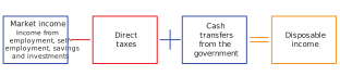
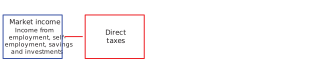
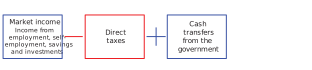
Figure 5.3 Market income and disposable income. Start with market income and subtract any direct taxes a person pays. Then add any cash transfers a person receives from the government. The result is the person’s disposable income.

Market income
Market income with taxation
Market income with taxation and transfers
Disposable income
The Gini coefficient
- the distribution of income
- The distribution of income describes how income in a society is divided among its people or groups, such as between individuals, households, or social classes.
- Gini coefficient
- A measure of inequality of a quantity such as income or wealth, varying from a value of 0 (if there is no inequality) to 1 (if a single individual receives all of it). The Gini coefficient is calculated as the average difference in an outcome (such as income) between every pair of individuals in the population relative to the mean of the outcome, multiplied by one-half.
To understand the distribution of income and assess the extent of inequality among people in a country, we can compare people’s incomes. To measure inequality, economists often use the Gini coefficient, named for the Italian statistician Corrado Gini (1884–1965). The Gini coefficient is based on differences in incomes, wealth, or some other measure of living standards. A Gini coefficient of 1 corresponds to perfect inequality (one person has all the income), and a Gini coefficient of 0 corresponds to perfect equality (everyone has the same income). Most countries fall between 0.2 and 0.7. The higher the value, the higher the level of inequality in that economy.
Comparing the Gini coefficient of market and disposable incomes across countries
Everyday Economics 5.2
Choose a different country in Figure 5.4 from the Netherlands or the United States. Does that country have greater or lesser inequality—in disposable or market income—than the Netherlands? Explain.
Figure 5.4 compares the Gini coefficients for market income and disposable income across a large sample of countries. The countries are ordered from top to bottom from the least unequal to the most unequal by disposable income (the length of the red bar). The figure also shows the Gini coefficient for market income, which is the full length of the bar (the blue bar plus the red bar). For example, the Gini coefficient in disposable income for the Netherlands in 2020 was 0.30 (the length of the red bar only) and the Gini coefficient for market income in the Netherlands in 2020 was 0.45 (the full length of the Netherlands’ blue bar plus its red bar).
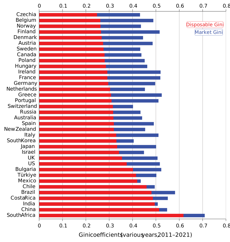
Figure 5.4 Income inequality in market income and disposable income across the world, 2011–2021. View a different visualization of this data at OWiD.
OECD. Income Distribution Database.
The axes for the comparison of market and disposable income Gini coefficients for a set of countries
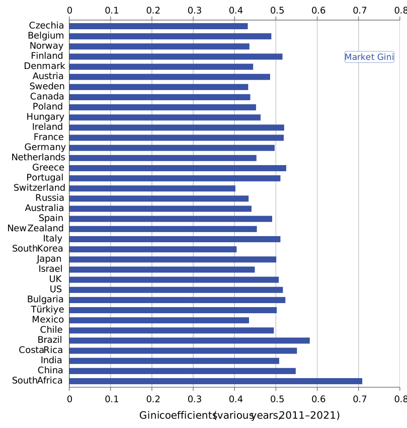
The market income Gini coefficients for a set of countries
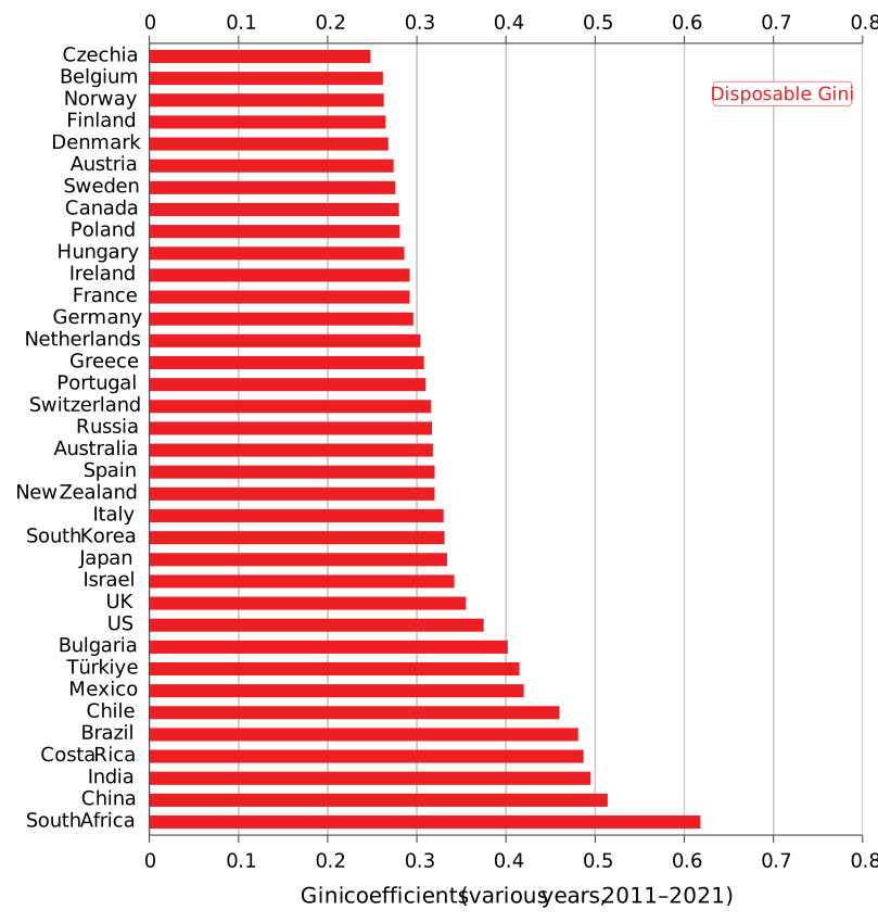
The disposable income Gini coefficients for a set of countries
The market income and disposable income Gini coefficients for a set of countries.
We use the World Bank’s definition of high-income, middle-income, and low-income countries.
- fiscal policy, discretionary fiscal policy
- Fiscal policy refers to policies setting the levels of taxes, transfers, and other government spending.
- progressiveness of tax-and-transfer systems
- The progressiveness of a tax-and-transfer system describes the extent to which taxes and government transfers reduce inequality in disposable income by taking a larger share from people with higher incomes and/or directing more support to people with lower incomes.
The substantial differences between nations in disposable income inequality occur partly because governments redistribute income by taxing well-off families and transferring the proceeds to households with lower incomes. That is, they differ in their fiscal policy, or their government’s taxation, transfer, and spending policies. In the United States, the market Gini coefficient is 0.52 and the disposable income Gini is 0.38. The difference between the United States and the Netherlands suggests that the Dutch government’s taxation and transfer policies led to a more equal distribution of disposable income than in the United States. A tax-and-transfer system that makes disposable incomes more equal is called a progressive tax-and-transfer system.
Everyday Economics 5.3
The Gini coefficient for disposable income does not include goods and services provided by the government. For example, a family whose children attend public school free of charge does not pay directly for that schooling, whereas another family whose children attend private school pays privately for that schooling. But trying to change the measures of all goods and services is hard: Do we add the value of what people might have paid for schooling to the disposable income of the family who didn’t pay for public schooling and received a benefit from it? Or do we reduce the income of the family that paid for private school? How do you think we could account for these differences when trying to make like-for-like comparisons of disposable income? Explain.
Look again at Figure 5.4. We can identify three common threads:
- Differences in disposable income inequality exceed differences in market income inequality. The differences between countries in disposable income inequality (the red bar, ranging from 0.25 to 0.62) are greater than the differences in market income inequality (red bar + blue bar, ranging from 0.4 to 0.71). Disposable income inequality differs more because countries differ in their redistributive policies: for example, how much more tax higher-income earners pay, and how much of those revenues governments redistribute to people lower in the income distribution.
- Inequality is common in high-income countries, but it varies by country. The United States and the United Kingdom have greater inequality than other high-income countries such as Belgium, Norway, Canada, France, and Germany.
- Inequality is also common in middle-income countries. The few middle-income countries—for example, Brazil, India, China, and South Africa—are even more unequal in disposable income than the United States.
Government redistribution, however, operates only after the market sets incomes. Inequality is also inherited through the endowments people begin with: it is greater where inheritances go lightly taxed, where educational policies let wealthy families buy more and better schooling for their children, and where people tend to marry others of similar wealth. Passed from parents to children, these advantages point us toward another kind of inequality—inequality that arises from accidents of birth.
Extension 5.2a Measuring the Gini coefficient with a network
To understand how to measure inequality using the Gini coefficient, we start with some history and an example of an “economy” with a high level of equality (a low Gini coefficient) and compare it to another that was more unequal (a high Gini coefficient). What’s the economy we’re interested in? The economy of a pirate ship!
The late 1600s and early 1700s were prime years for pirates. Perhaps one of your distant ancestors was an unemployed sailor who joined a pirate ship. Perhaps he settled on the Royal Rover, one of the pirate ships of the famous Captain Bartholomew Roberts, known as Black Bart. Despite the unruly and reckless activities for which pirates are known, aboard the ship your ancestor and his crewmates would’ve had to comply with the “The Rover’s Articles,” a document that set out rules of conduct for the pirates and also guaranteed them several rights (Figure E5.1).
The Royal Rover and its articles were standard during the heyday of piracy. Most pirate ships had written rules of behavior and granted powers to the ship’s crewmembers. Captains were democratically elected by all crewmembers, and captains who acted cowardly during battle could be voted out. The crew also elected one crewmember as the quartermaster (or “master,” for short), who could countermand the captain’s orders when the ship was not in a battle. If your ancestor had served as a lookout and had been the first to spot a ship that was later taken as a prize, he would have received as a reward “the best Pair of Pistols on board.” If a crewmember was seriously wounded in battle, the articles guaranteed him compensation.

Figure E5.1 Illustration of “The Royal Rover’s Articles.”
Peter T. Leeson. 2007. “An-arrgh-chy: The Law and Economics of Pirate Organizations”. Journal of Political Economy 115 (6): pp. 1049–1094.
We introduced the term institutions in Section 1.3: They are important for understanding the rules of the game principle.
- institutions
- An institution is a set of laws and informal rules that regulate social interactions among people, and between people and the biosphere; sometimes also termed “the rules of the game.”
- payoff
- The players’ payoffs are a list of numbers identifying how much the players value each combination of actions that they can take in the game.
The Royal Rover’s articles specified the pirates’ working conditions. They determined who did what aboard the ship and what each crewmember got. Pirates also had unwritten informal rules of appropriate behavior that they followed by custom or to avoid condemnation by their crewmates. These rules, written and unwritten, were the institutions that governed the interactions among the pirates on the Royal Rover.
The rules of the game limited pirates’ choices (no drinking after 8 p.m. unless on deck) and acted as constraints. They incentivized behavior by providing valuable benefits (the best pair of pistols for the lookout who spotted a ship that was later taken). By specifying the written and unwritten rules, institutions also conditioned each pirate’s beliefs about their crewmates’ expected behavior.
The rules of the game also affected who got what, including how the total treasure (or “booty”) was divided among the pirates (the payoffs). According to the Rover’s articles, the captain was to receive “two Shares of a Prize” while the quartermaster received “one Share and a half” and non-officers received one share. In this arrangement, we see an early example of income inequality.
Exercise E5.1 Institutions and fairness on a pirate ship
Pirate ships had both unwritten and written rules, such as “The Rover’s Articles,” that governed behavior and established rights. Reflect on how these institutional rules might contribute to social order and fairness aboard a pirate ship. How are these rules similar to or different from rules in social groups of which you are a part?
Question E5.1
Which of the following statements about the rules and institutions aboard the Royal Rover are correct? Choose all that apply.
- The written articles and unwritten customs were institutions that structured pirates’ interactions.
- The rules also provided incentives, such as rewards for spotting a prize ship.
- Institutions shaped expectations about others’ behavior.
- The rules determined how treasure was divided, influencing the level of inequality among crewmembers.
Measuring economic inequality with a network
We use the concept of a network to understand the inequality in a system or economy, such as the economy of the pirate ship Rover.
What is a network?
- network
- A network is a structure composed of interconnected people (or objects) and the connections among them.
A network is a structure composed of interconnected people (or objects) and the connections among them. In talking about a network, we use the following language:
- Node: A node is a person, a firm, a household, or an organization. On the pirate ship Rover, the captain is one node, the quartermaster is another node, and a crewmember is a third node.
- Edge: An edge is the connection one person (or node) has to another person (or node). For example, if you are friends with someone, then we would call that friendship an “edge” in a network.
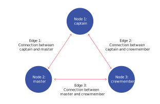
Figure E5.2 The components of a network between three members of the crew: the captain, the master, and a crewmember.

Start with the first node: The captain
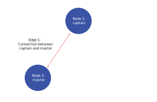
Two nodes and an edge: The captain and the master
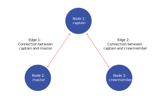
Three nodes and two edges: The captain, the master, and the crewmember
Three nodes and three edges: The captain, the master, and the crewmember
Let’s consider a set of people and the connections between them. The people comprise a set of nodes. Each node corresponds to a different person on the pirate ship. We start with a three-member pirate ship in Figure E5.2. The circle for the captain is node 1, the circle for the master is node 2, and the circle for the crewmember is node 3. Each of them is connected to the other by a red double-headed arrow that shows the edge as the connection: the captain to the master (edge 1), the captain to the crewmember (edge 2), and the master to the crewmember (edge 3). Work through the steps of Figure 5.3 to see how the network is formed.
Using a network to understand inequality on the pirate ship
- the distribution of income
- The distribution of income describes how income in a society is divided among its people or groups, such as between individuals, households, or social classes.
- inequality
- Inequality refers to the degree to which income, wealth, or other economic resources are distributed unevenly among people or groups in a society. It can be measured using statistical tools such as income percentiles, the Gini coefficient, or income shares held by different segments of the population (for example, the top 10% vs. the bottom 10%, called the Rich/Poor ratio).
To understand the distribution of income on the pirate ship or the inequality among the pirates on the ship, we can compare the pirates’ income. Economists often use a measure of inequality, called the Gini coefficient, named for the Italian statistician Corrado Gini (1884–1965). The Gini coefficient is based on differences in incomes, wealth, or some other measure of living standards. We can use the nodes in Figure E5.3 to construct the Gini coefficient of life on a pirate ship.
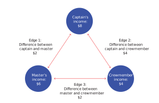
Figure E5.3 Income differences among pairs of pirate ship members. The Gini coefficient with these income shares is 0.22.
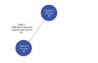
The difference in the incomes of the captain and the master
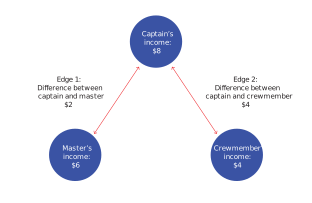
The difference in the incomes of the captain, the master, and the crewmember
The incomes of the captain, the master, and the crewmember and the differences in all their incomes
If you’re not sure where these numbers come from, return to Figure E5.1 and check the rules of the pirate ship to see why, if a “share” is $4, the captain gets $8 and the master gets $6.
We call the people we’re trying to understand a population: in this case, the captain, the master, and the crewmember. To understand how to construct the Gini coefficient, consider Figure E5.3. As in Figure E5.2, the circles represent each member. Figure E5.3 adds their incomes. A “share” is $4 in our example. Following the rules outlined in section E5.1 about what each person receives, the captain receives $8, the master receives $6, and the crewmember receives $4. The total income on this little pirate ship is $18. The numbers next to the double-sided arrows are the differences between the two ship members indicated by the arrows. Work through the steps in Figure E5.3 to see how the differences in income are calculated for each connection in the network.
We calculate the Gini coefficient from two pieces of information:
- The average of the differences between the ship members: the sum of all the differences between the ship members divided by the number of ship members.
- The average income of the ship members: the total income divided by the number of ship members.
We use this information to write an equation for the Gini coefficient:
\[\text{Gini coefficient} = \frac{(\text{Average differences}/2)}{\text{Average income}}\]We can now calculate the Gini coefficient for the pirate ship example:
- Average difference: The individual differences are \((4 + 2 + 2)/3 = 8/3 = 2.67\)
- Average income: In the example, the average is \((8 + 6 + 4)/3 = 6\)
The Gini coefficient is equal to the first number (the average difference) divided by two, which is then divided by the second number (the average income). For our example, $2.67/2 = $1.33. The Gini coefficient equals $1.33/6 = 0.22.
How did inequality on pirate ships and navy ships compare?
We can calculate the Gini coefficient for a pirate ship with many ordinary crewmembers, not only one crewmember. It turns out that the prize-sharing system described in the articles of the Royal Rover led to a very low level of income inequality among the pirates on that ship. Its Gini coefficient was only 0.06, which is almost 0!

A Dutch man-of-war (similar to a British one) firing its cannons.
The Cannon Shot, c. 1680, painting by Willem van de Velde the Younger. Public domain. Rijksmuseum Amsterdam.
In contrast, the division of the spoils on the British Royal Navy’s ships, Favourite and Active, was far less equal. When the two British man-of-war ships captured the Spanish treasure ship La Hermione, ordinary crewmembers received about a quarter of the income, with the remainder going to a small number of officers and the captain. Figure E5.4 compares the Gini coefficients for the three ships.
By the standards of the day, the pirates disliked inequality and were more fair-minded in their dealings with each other than the Royal Navy.
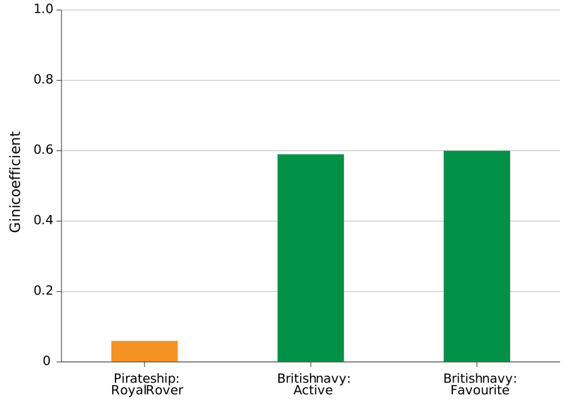
Figure E5.4 The distribution of spoils: inequality among pirates and the British navy.
Peter T. Leeson. 2009. “The Invisible Hook: The Law and Economics of Pirate Tolerance”. New York University Journal of Law and Liberty 4(2): pp. 139–171; Robert Beatson. 1804. Naval and Military Memoirs of Great Britain, from 1727 to 1783 (vol. 3). Longman, Hurst, Rees and Orme.
Exercise E5.2 Income distribution and Gini coefficient
The captain, the master, and the crewmember on the Royal Rover have a total income of $24. Use the following income distributions to calculate the Gini coefficient for each scenario:
- Scenario 1: The captain receives 14, the master receives 6, and the crewmember receives 4.
- Scenario 2: The captain receives all 24.
- Scenario 3: All three members receive the same income of 8.
(Hint: To calculate the Gini coefficient, you’ll need to find the average differences in income between the members and the average income for the population.)
After calculating, explain how the distribution of income affects the Gini coefficient.
Extension 5.2b Comparing the rich/poor ratio and the Gini coefficient
Another measure that we can use to assess inequalities is the rich/poor ratio. We defined the rich/poor ratio in Extension 3.7 as follows:
\[\text{rich/poor ratio} = \frac{\text{average income of richest 10%}}{\text{average income of poorest 10%}}\]Figure E5.5 shows the rich/poor ratio for a set of countries, some of which are also included in Figure 5.4. Each country is shown on the horizontal axis, and the value of the rich/poor ratio (the factor by which the income of the richest 10% exceeds the income of the poorest 10%) is shown on the vertical axis. Similar to our findings when we used their Gini coefficients, South Africa, Brazil, and India remain among the most unequal countries because they have high rich/poor ratios. In South Africa, the richest have incomes roughly 900 times the incomes of the poorest; in Brazil, the richest have incomes roughly 300 times the incomes of the poorest; and in India, the richest have incomes roughly 250 times the incomes of the poorest. Based on the rich/poor ratio, the United Kingdom is more unequal than China is. Germany and Denmark are relatively equal, and the United States is comparable to them, showing less inequality than the UK and Germany. When we used the Gini coefficient as our measure, the US had higher inequality than the UK and Germany.
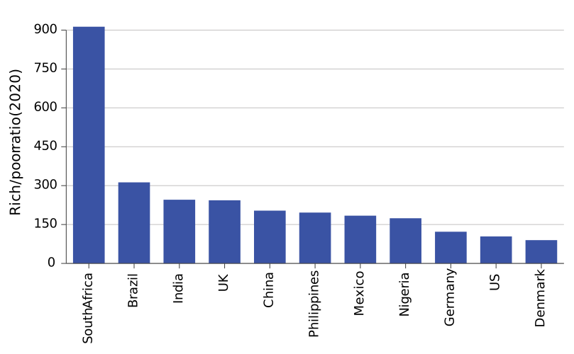
Figure E5.5 The rich/poor ratio in 2020.
Our World in Data – processed by Our World in Data. “World region according to OWID” [dataset]. Our World in Data, “Regions”.
Compared with the rich/poor ratio, the Gini coefficient has the advantage of including information about everyone—not just the rich and the poor, but also people “in the middle.” The rich/poor ratio is easier to understand because it does not require an understanding of networks and the mean differences among people in a network (see Extension 5.2a). Nonetheless, the Gini coefficient and the rich/poor ratio are both widely used measures of welfare because they can be quantified numerically—for example, in terms of income or wealth.
Exercise 5.2 Disposable income and Gini coefficients
- Define each of market income and disposable income and explain the difference between them with an example. Why is disposable income often used when comparing living standards across countries?
- Look at the Gini coefficients in Figure 5.4. Which country shown has the highest inequality in disposable income? Which country has the lowest?
- Sweden has a lower Gini coefficient of disposable income than the United States. Explain how Sweden’s more progressive tax system may contribute to this.
Question 5.2
Which of the following statements about the Gini coefficient are correct? Choose all that apply.
- A Gini coefficient of 0 represents complete income equality, meaning everyone has the same income.
- A Gini coefficient of 1 represents perfect income inequality, where one person has all the income.
- The Gini coefficient increases as income inequality increases, not decreases.
- A higher Gini coefficient indicates greater income inequality.
Question 5.3
How does a progressive tax-and-transfer system affect the Gini coefficient?
- Taxes and transfers generally reduce inequality by redistributing wealth from high-income to low-income individuals, thereby decreasing the Gini coefficient.
- Taxes (especially progressive taxes) and transfers (such as welfare benefits) reduce the income gap, lowering the Gini coefficient and reducing inequality.
- Taxes and transfers do impact the Gini coefficient, usually lowering it by narrowing income disparities.
- Taxes and transfers reduce inequality in all countries, not just high-income countries, by redistributing resources to lower-income households.

